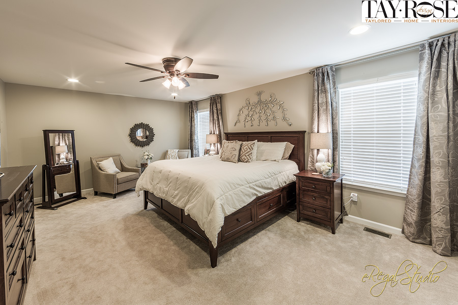
Master Suite in neutrals
So many of us are so busy that we rarely have time to enjoy and retreat to our Master Oasis’s until the family has been fed; dishes done; lunches made for the next morning; kids bathed; stories read; kids tucked in; laundry folded; and bills paid…..so, collapsing into the bed that may or may not have been made that morning, and falling immediately into an unconscious slumber is how our Master bedroom meets our need. And yet, trends reveal when it comes to designing, or building a house, clients want the master suite, and “en-suite” to be spacious with sitting areas, even exercise machines with adjoining steam showers, double vanities and tv sets as their “must haves.” Who has time to enjoy all of this blessedness? But hey, who wouldn’t want a restful, spacious area to retreat to at the end of a hectic day? We all deserve a space that beckons when the day is done, and the door can be closed to put the world on a time out.
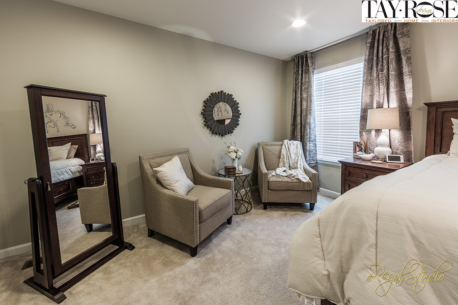
Master suite sitting area in neutrals
This Master bedroom space was one of those spaces where I wanted to create a soothing break from the demands that every young parent lovingly accepts. The client had sent me several photos of colors and styles they liked for the room which were very helpful to draw inspiration from and recreate for them. Neutrals were chosen, in creams and taupe with a bit of gray. Lots of texture from the nubby linen and metal nail heads of the casual chairs; the cool metal from the glass side table; to the painted metal art on the wall over the bed; and the soft cream of the carpet underfoot. The warm woods of the bed, nightstands and dresser give a nice contrast to all of the neutral colors surrounding the room.
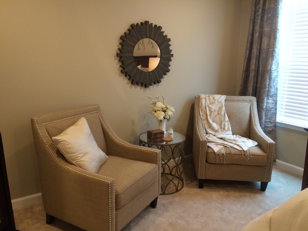
Seating grouping in master
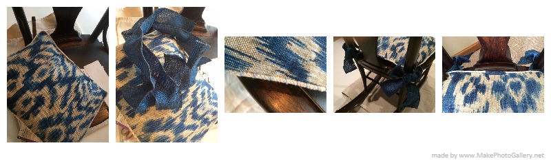
The comforter was a great find at Burlington’s and was the light neutral color that the client was looking for. It’s hard to see, but there are fine light gray lines creating a subtle pattern on the fabric. I was able to find matching shams, a throw, and all of the accent pillows at several different stores while shopping for accessories. We found long curtain panels that had beautiful texture and just the perfect colors of gray and taupe to frame the windows and carry the color to the walls. We hung the panels higher over the window to draw your eye up and helps the room feel larger.
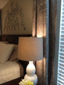
Cream lamp and curtain panel by bedside
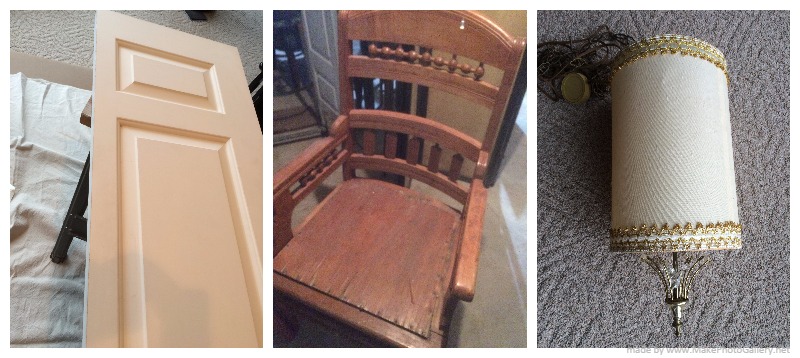
I found the lamps and shades, in a simple shape, creamy like the trim color and a few photo frames to be filled with kiddo pictures in black and white to keep with the neutral scheme. The design rule of grouping in 3’s and 5’s really does work in most cases, and helps surface areas from getting too cluttered. Choosing groups that have different heights and shapes gives the items more definition and interest. A small seating area was created on the back wall with a couple of nubby chairs, a small glass top table and then adding the accent mirror centered over the grouping instead of centering the mirror on the wall. The standing dressing mirror fit perfectly just outside the entrance to the master bath plus doubles as a jewelry cabinet- I love when products can be double duty…so functional!!
Since the bed should really be the focal point of the room, I wanted something light and airy for the space over the large bed. While in the Home Store, I found a large grey metal floral leaf art piece that was pointing up and leaning against the wall. I picked it up and immediately turned it upside down. Perfect! I just needed to take some cream colored chalk paint and lightly distress the metal a bit to soften the color and bring it more to a neutral but still have that hint of gray coming through….just like the comforter….get where I am going with this? Why upside down? Well, I think it looked better upside down, and I liked how the bottom which is now the top was narrower than the top which is now the bottom, and it seemed to “hug” the bed. Did I lose anyone? It’s fun to change up something whether it’s turning it upside down, or sideways, or adding a piece to it, or changing the color…..it’s all part of the design process.
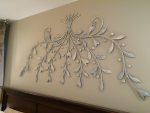
Floral metal wall art painted and distressed
You will notice that there is a lot of wall space in this room, and we do have future plans for that. To the right of the bed, the wall leading to the master closet will be a grouping of black and white wedding photos framed and hung, one which will be enlarged to go behind an old pane window.
It’s important to carve out a space where you can escape…..even if just for a little while to rejuvenate….not only will you benefit from the results it can bring, but your family will appreciate it as well. Even something so simple as making the bed and finding homes for the clothes that made their way to the floor, can do wonders when you drag yourself at the end of the day to a space that is welcoming you back.
To receive posts via email click HE RE  Subscribe in a reader or signup in Subscription box in sidebar.